
Posted on Apr 17, 2025 | Frontend
Master Layout in CSS by Flexbox. Build a Simple NavBar
Hey Devs
You've probably struggled at some point trying to center something on a webpage or make your content align nicely in rows and columns. Don't worry—we've all been there. Fortunately, Flexbox is here to save your layout headaches.
Flexbox (short for Flexible Box Layout) is like a magical container that helps you align, distribute, and organize space among items in a one-dimensional layout—either horizontally (in a row) or vertically (in a column).
In this guide, we'll take a walk through the world of Flexbox, using real-world analogies to make everything feel a little less abstract. By the end, you'll have a solid foundation and the confidence to start using Flexbox like a pro.
The Flex Container and Its Items
Let's imagine you're arranging items on a bookshelf.
- The bookshelf is your flex container.
- The books on the shelf are your flex items.
To make the bookshelf flexible, you simply tell CSS:
display: flex;
This one line transforms your ordinary container into a flex container, and all of its direct children (the books) become flex items.
<div class="bookshelf">
  <div class="book">📘</div>
  <div class="book">📙</div>
  <div class="book">📗</div>
</div>
.bookshelf {
  display: flex;
}
Direction: Row or Column?
Now that we've got our bookshelf, we decide how we want to arrange our books: side by side or stacked.
flex-direction: row;→ default, left to right.flex-direction: column;→ top to bottom.
.bookshelf {
  display: flex;
  flex-direction: row; /* or column */
}
It's like choosing whether to stack books horizontally across a shelf or vertically down a wall.
Main Axis vs Cross Axis
Here's a key idea in Flexbox: everything happens along two axes:
- Main Axis: The primary direction you chose (row or column).
- Cross Axis: The perpendicular direction.
So if your flex-direction is row, then:
- Main axis = horizontal
- Cross axis = vertical
If it's column, then:
- Main axis = vertical
- Cross axis = horizontal
Flexbox properties are based around these axes.
Justify Content: Align Along the Main Axis
Want to spread your books out evenly or push them to one side? Use justify-content.
justify-content: flex-start;     /* All books pushed to the start */
justify-content: flex-end;       /* All books pushed to the end */
justify-content: center;         /* Books centered */
justify-content: space-between;  /* Equal space *between* books */
justify-content: space-around;   /* Equal space *around* books */
justify-content: space-evenly;   /* Equal space *between and around* */
Imagine sliding the books along the shelf to arrange them just right.
Align Items: Align Along the Cross Axis
Now, maybe you want your books to line up neatly top to bottom on the shelf. This is where align-items comes in.
align-items: stretch;     /* Default: items stretch to fill */
align-items: flex-start;  /* Items align to the top (or left if column) */
align-items: flex-end;    /* Items align to the bottom (or right if column) */
align-items: center;      /* Items align in the center */
It's like making sure all your books are standing at the same height—or letting some lie down!
Flex Wrap
What if you have too many books for one row?
By default, Flexbox tries to keep everything on a single line and sometimes the elements can appear squished. But you can change that:
flex-wrap: wrap;
Now your books will wrap onto a new line (like starting a new shelf when one fills up).
Gap
Want to give your books a bit of space between each other?
gap: 16px;
Just like adding a little cushion between items so they're not bumping into each other.
Flex Item Properties: Make Items Flexible
Each book (flex item) can have its own behavior using:
flex-grow: 1;     /* Can grow to fill extra space */
flex-shrink: 1;   /* Can shrink to prevent overflow */
flex-basis: 200px;/* Preferred starting size */
Or combine all three into one:
flex: 1; /* shorthand for grow, shrink, basis */
So if you want one book to take up twice as much space as another:
.book.big {
  flex: 2;
}

.book.small {
  flex: 1;
}
Align Self: Individual Alignment
Want just one book to be different? Maybe one is taller or leans a little.
.book.special {
  align-self: flex-end;
}
This overrides align-items for that specific item.
A Real-World Example: Building a Simple Navbar
Now that you've got the basics, let's build something real: a navbar using Flexbox.
The HTML
<!DOCTYPE html>
<html>
  <head>
    <title>Hello, World!</title>
    <link rel="stylesheet" href="styles.css" />
  </head>
  <body>
    <nav class="navbar">
  <h1 class="logo">Ujjwalit</h1>
  <div class="nav-links">
    <a href="#">Home</a>
    <a href="#">About</a>
    <a href="#">Contact</a>
  </div>
</nav>
  </body>
</html>
We've got a logo on the left and some links on the right.
The CSS
body{
  padding: 25px;
  font-family: Arial;
}

.navbar {
  display: flex;
  justify-content: space-between;
  align-items: center;
  padding: 16px 24px;
  background-color: #333;
  color: white;
}

.nav-links {
  display: flex;
  gap: 16px;
}

.nav-links a {
  color: white;
  padding: 10px;
  border: 1px solid;
  text-decoration: none;
  font-weight: 500;
  transition: 0.5s ease-in;
}

.nav-links a:hover{
  background: white;
  color: black;
}
What's happening here?
- The
.navbaris the bookshelf. - The logo and nav links are the books.
justify-content: space-betweenspreads them apart.align-items: centerkeeps everything vertically centered..nav-linksis also a mini Flexbox container so the links sit side by side.
It's super clean and easy to maintain.
Here is the output 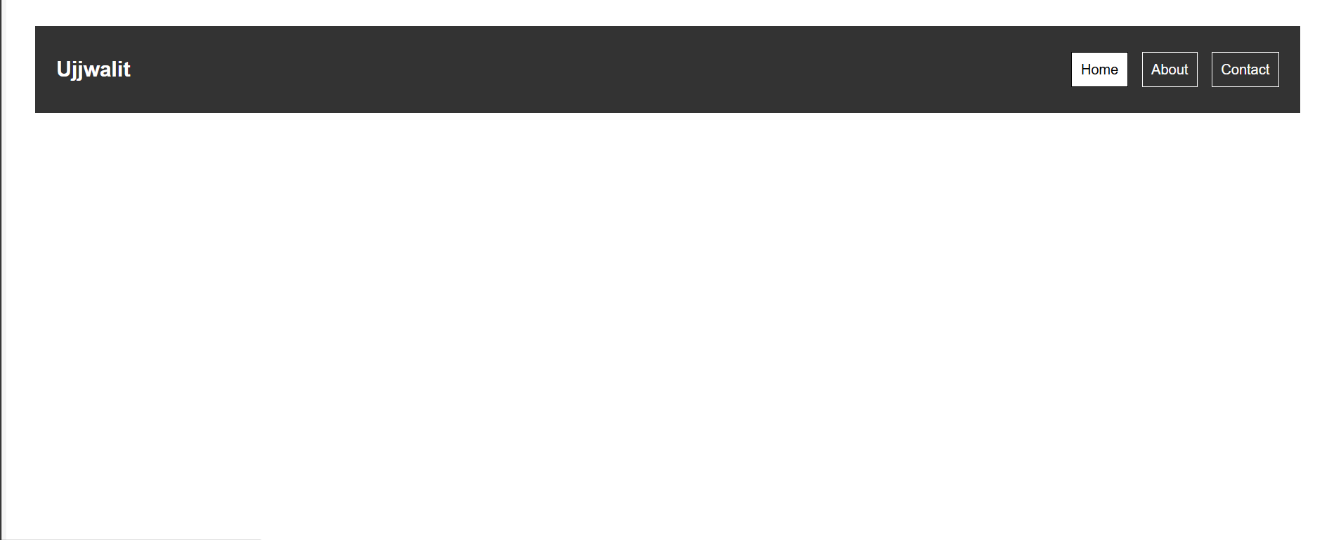
The white link is due to hover effect. If you want to learn about transitions and pseudo classes check out this blog here.
When Should You Use Flexbox?
Flexbox is perfect when:
- You want to align items in a row or column.
- You need spacing, centering, or equal distribution.
- You're building a navigation bar, card layout, or sidebar.
For more complex, two-dimensional layouts (like full-page grids), you might want to explore CSS Grid—but that's a story for another day.
Quick Recap
| Property | What It Does |
|---|---|
display: flex |
Activates flex layout for the container |
flex-direction |
Sets direction (row or column) |
justify-content |
Aligns items along the main axis |
align-items |
Aligns items along the cross axis |
flex-wrap |
Allows items to wrap onto multiple lines |
gap |
Adds spacing between items |
flex |
Sets growth, shrink, and basis of individual items |
align-self |
Overrides alignment for individual flex items |
Conclusion
CSS Flexbox is one of those tools that makes your life way easier once you get the hang of it. Think of it as a smart, flexible layout assistant that helps you organize content effortlessly—just like arranging books on your dream shelf.
In upcoming posts, we'll explore CSS Grid, media queries, and responsive design tips that pair beautifully with Flexbox.
Want to keep learning?
Sign up on our platform or join our WhatsApp channel here to get more hands-on guides like this, delivered regularly.
See you in the next blog. Until then, keep practicing and happy learning!
4 Reactions
0 Bookmarks