

Posted on Apr 23, 2025 | Frontend
Master Layout in CSS by Grid. Build a Simple Skills Section
Hey Devs!
Imagine your webpage is a city map. Roads run in straight lines, neighborhoods are organized into blocks, and everything has its place. CSS Grid is your tool to create this structured, two-dimensional layout. Let’s build a simple skill section together while learning Grid basics!
1. The Grid Container: Your City's Blueprint
Think of your webpage as a brand new city waiting to be built. The grid container is like the city limits - it defines where all your buildings (content) will go. Just like a city planner starts with an empty plot of land, you start with a simple HTML element that will become your grid.
<div class="profile-page">
  <!-- All your content goes here -->
</div>
To turn this into a grid, you just need one magical line of CSS:
.profile-page {
  display: grid;
}
This single property does three important things:
- Activates Grid Layout: The element becomes a grid container
- Affects Direct Children Only: Only immediate child elements become grid items (grandchildren don't)
- Resets Some Defaults: Floats and other properties behave differently in a grid context
Here's what happens to the children:
- Header, main content, sidebar, footer - these all become grid items
- They automatically arrange themselves in a single column (the default behavior)
- Their display types don't matter anymore - they all become grid items
Pro Tip: You can verify your grid is working in Chrome DevTools:
- Right-click your grid container and select "Inspect"
- Look for the "grid" badge next to the element
- Click it to visualize your grid layout
Common Mistakes:
- Only direct children become grid items (nested elements don't)
- Floats and vertical-align won't affect grid items
- Margins collapse differently in grid layout
Remember: Just like a city needs boundaries before you can start planning streets, your webpage needs this grid container before you can define rows and columns. This is the foundation everything else builds upon!
2. Rows & Columns: Streets and Avenues
In Grid, you define the layout’s structure using rows (horizontal) and columns (vertical) — just like planning streets and avenues in a city.
.profile-page {
  grid-template-columns: 1fr 250px;   /* 2 columns: flexible + fixed */
  grid-template-rows: 80px 1fr 60px;  /* 3 rows: header, content, footer */
  gap: 20px; /* Space between items */
}
1fr: A flexible column that takes up the remaining space (like a stretchable road).250px: A fixed-width column — always the same size (like a narrow street).80px,1fr,60px: Defines the height of the rows — a fixed header, a flexible content area, and a fixed footer.gap: Adds space between rows and columns (like spacing between streets).
This gives you a neat, structured layout with both fixed and flexible areas — simple and easy to manage.
3. Place Items: Label Your Map
Use named areas to assign sections to zones:
.profile-page {
  grid-template-areas:
    "header  header"
    "main    sidebar"
    "footer  footer";
}

.header  { grid-area: header; }
.main    { grid-area: main; }
.sidebar { grid-area: sidebar; }
.footer  { grid-area: footer; }
grid-template-areas: Maps out your layout visually.grid-area: Assigns items to their zones.
4. Skill Cards with Subgrid: Keeping Content Aligned
Let's build a skills section where each card uses subgrid to maintain perfect alignment - even when content lengths vary.
The Problem Without Subgrid
When skill descriptions have different lengths, cards become misaligned:
.skills {
  display: grid;
  grid-template-columns: repeat(3, 1fr);
  gap: 20px;
}

.skill-card {
  /* No subgrid - each card manages its own layout */
}
Result:
- Cards stretch unevenly
- Titles and buttons jump to different positions
- Visual hierarchy breaks
The Solution: Subgrid Alignment
.skills {
  display: grid;
  grid-template-columns: repeat(3, 1fr);
  gap: 20px;
}

.skill-card {
  display: grid;
  grid-template-rows: subgrid; /* Magic alignment! */
  grid-row: span 3; /* Each card spans 3 rows */
  gap: 10px;
}
HTML Structure
<!DOCTYPE html>
<html lang="en">
<head>
<meta charset="UTF-8" />
<meta name="viewport" content="width=device-width, initial-scale=1.0" />
<title>Ujjwalit - Skills Overview</title>
<link href="https://fonts.googleapis.com/css2?family=Inter:wght@400;600&display=swap" rel="stylesheet">
<link rel="stylesheet" href="styles.css">
</head>
<body>
<header>
<h1>Team Ujjwalit – Skills Showcase</h1>
<p class="subtitle">Explore our capabilities across modern web development and team leadership.</p>
</header>
<main>
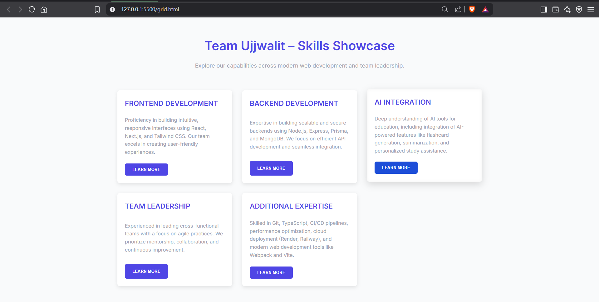
<section class="skills-grid">
<div class="skill-card">
<div class="card-grid">
<h3>Frontend Development</h3>
<p>Proficiency in building intuitive, responsive interfaces using React, Next.js, and Tailwind CSS. Our team excels in creating user-friendly experiences.</p>
<button>Learn More</button>
</div>
</div>
<div class="skill-card">
<div class="card-grid">
<h3>Backend Development</h3>
<p>Expertise in building scalable and secure backends using Node.js, Express, Prisma, and MongoDB. We focus on efficient API development and seamless integration.</p>
<button>Learn More</button>
</div>
</div>
<div class="skill-card">
<div class="card-grid">
<h3>AI Integration</h3>
<p>Deep understanding of AI tools for education, including integration of AI-powered features like flashcard generation, summarization, and personalized study assistance.</p>
<button>Learn More</button>
</div>
</div>
<div class="skill-card">
<div class="card-grid">
<h3>Team Leadership</h3>
<p>Experienced in leading cross-functional teams with a focus on agile practices. We prioritize mentorship, collaboration, and continuous improvement.</p>
<button>Learn More</button>
</div>
</div>
<div class="skill-card">
<div class="card-grid">
<h3>Additional Expertise</h3>
<p>Skilled in Git, TypeScript, CI/CD pipelines, performance optimization, cloud deployment (Render, Railway), and modern web development tools like Webpack and Vite.</p>
<button>Learn More</button>
</div>
</div>
</section>
</main>
</body>
</html>
CSS Structure
/* Base Styles */
:root {
    --primary: #4F46E5;  /* Slightly brighter purple */
    --secondary: #1D4ED8; /* Blue for hover */
    --text: #333; /* Darker text for better readability */
    --light-bg: #f9fafb; /* Light background */
    --light-gray: #9CA3AF; /* Lighter gray for subtext */
    --card-shadow: 0 4px 12px rgba(0, 0, 0, 0.1); /* Stronger shadow */
}

body {
    font-family: 'Inter', sans-serif;
    line-height: 1.6;
    color: var(--text);
    max-width: 1200px;
    margin: 0 auto;
    padding: 2rem;
    background: var(--light-bg);
}

header {
    text-align: center;
    margin-bottom: 3rem;
}

h1 {
    font-size: 2.5rem;
    font-weight: 600;
    margin-bottom: 0.5rem;
    color: var(--primary); /* Primary color for the header */
}

.subtitle {
    font-size: 1.125rem;
    color: var(--light-gray); /* Softer color for the subtitle */
}

/* Main Grid Container */
.skills-grid {
    display: grid;
    grid-template-columns: repeat(auto-fit, minmax(280px, 1fr));
    gap: 2rem;
    padding: 1rem;
}

/* Skill Card - Outer Grid */
.skill-card {
    display: grid;
    border-radius: 0.5rem;
    overflow: hidden;
    background: white;
    box-shadow: var(--card-shadow);
    transition: transform 0.2s ease, box-shadow 0.3s ease;
}

.skill-card:hover {
    transform: translateY(-4px);
    box-shadow: 0 8px 24px rgba(0, 0, 0, 0.15); /* Slightly more pronounced shadow */
}

/* Card Inner Grid with Subgrid */
.card-grid {
    display: grid;
    grid-template-rows: auto 1fr auto; /* Title, Description, Button */
    gap: 1.5rem;
    padding: 1.5rem;
    height: 100%;
}

/* For browsers that support subgrid */
@supports (grid-template-rows: subgrid) {
    .card-grid {
        grid-template-rows: subgrid;
        grid-row: span 3; /* Span all rows from parent */
        padding: 1.5rem;
    }
}

/* Card Content Styles */
.card-grid h3 {
    font-size: 1.4rem;
    font-weight: 600;
    margin: 0;
    color: var(--primary);
    text-transform: uppercase; /* Slightly more emphasis on title */
}

.card-grid p {
    margin: 0;
    color: var(--light-gray); /* Softer gray text for description */
    line-height: 1.6;
}

/* Button Styling */
.card-grid button {
    background: var(--primary);
    color: white;
    border: none;
    padding: 0.75rem 1.5rem;
    border-radius: 0.375rem;
    font-weight: 600;
    cursor: pointer;
    transition: background 0.3s ease, transform 0.3s ease;
    justify-self: start; /* Align button left */
    text-transform: uppercase; /* Button text styling */
}

.card-grid button:hover {
    background: var(--secondary); /* Hover color change */
    transform: translateY(-2px); /* Slight upward movement on hover */
}

/* Optional: A subtle hover effect on card */
.skill-card:hover .card-grid {
    box-shadow: inset 0 0 10px rgba(0, 0, 0, 0.05); /* Subtle inset effect for card */
}
Key Benefits:
- Perfect Vertical Alignment: All titles, descriptions, and buttons line up
- Consistent Spacing: Gap values inherit from parent grid
- Responsive by Default: Adapts to content changes gracefully
Browser Support Tip: Add fallback for non-supporting browsers:
.skill-card {
  grid-template-rows: auto 1fr auto; /* Fallback */
  @supports (grid-template-rows: subgrid) {
    grid-template-rows: subgrid;
  }
}
This approach works especially well for:
- Product feature grids
- Team member profiles
- Pricing tables
- Any card-based layout with variable content
Result
Cheat Sheet
| Property | What It Does |
|---|---|
display: grid |
Creates a grid container |
grid-template-columns |
Defines columns (e.g., 1fr 250px) |
grid-template-rows |
Defines rows (e.g., 80px 1fr) |
gap |
Adds spacing between items |
grid-template-areas |
Maps layout zones (e.g., "header") |
grid-area |
Assigns item to a zone |
When to Use CSS Grid
- Dashboards
- Image galleries
- Forms with multiple sections
Conclusion
CSS Grid is your city planning toolkit for the web. With rows, columns, and named areas, you can build clean, responsive layouts without hacks.
Challenge: Add a personal "Projects" section about yourself and update the grid areas!
Want to keep learning?
Sign up on our platform or join our WhatsApp channel here to get more hands-on guides like this, delivered regularly.
See you in the next blog. Until then, keep practicing and happy learning!
4 Reactions
0 Bookmarks